Mihir's N@TM Blog
Night at The Museum Overview
N@TM was an incredibly fun, energizing, and social event to attend. I was not only able to present my work to industry PROFESSIONALS, but also was able to learn a lot from other groups, while also taking interest in their projects. I thank Mr. Mortensen and whole Del Norte Team, and students for making this happen
I also arrived early to be able to be able to see other people’s projects.
Neptune
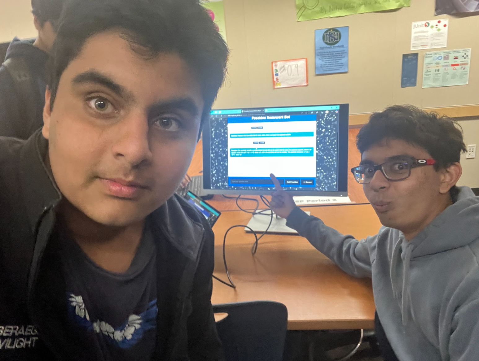
The first project I reviewed was Neptune, from Period 2. Here is what their project was about and some of the features they had:
Neptune is an interactive learning system designed to enhance student organization, collaboration, and personalization. It has a variety of features that simplify the student experience.
Upon logging in, the students are able to plan their class timetables by enrolling in their courses for each period. If a course does not exist, they can add it to make it available for future users.
The website offers theme personalization, allowing students to customize the interface to a color scheme of their choice, improving their experience as they engage more with the site.
Academically, Neptune offers an AI-powered homework support chatbot that gives step-by-step explanations without directly giving answers, promoting independent learning.
The students also have the option of using flashcards to create and quiz themselves on key concepts, reinforcing their learning through an interactive experience.
An instant chatroom provides real-time discussion of school topics and activities, develops a feeling of community, and makes collaboration more enjoyable.
Students can recognize their classmates as they scan the user list and add them as friends, making contact straightforward.
Overall, Neptune integrates organization, academic assistance, and social communication into a single and simple-to-use system, enhancing the student experience.
I found the coolest feature from here to be their chatbot which gives them hints, as this is something I had not thought about ever. Overall, I really liked their project because of their UI and Innovative Features.
Frostbyte
Another project I reviewed was Period 1’s Frostbyte. Frostbyte is a place for individuals to explore different national parks, and the Frostbyte team offered many ways to learn more about national parks.
Some of these include a:
-
Interactive Quiz: A quiz where users can discover which national park is most appropriate for their interest.
-
Featured Parks: Highlighting well-known parks such as Denali, Redwood, Buck Island Reef, and Grand Canyon, with highlights and activities.
-
Camping Information: Camping facility information, from family campgrounds to backcountry camping, with tips and suggestions on equipment.
-
National Parks Overview: A tour of the diversity and recreational opportunities in over 60 U.S. national parks, with a focus on planning and environmental respect.
-
User Engagement: Room for users to share their experiences with camping and become part of a community of outdoor adventure enthusiasts.
As a suggestion, I suggested adding a user map onto their page for them to explore more national parks across the United States. Regardless, I loved their topic and how nice and clear they have made their site.
Stocks Predictor
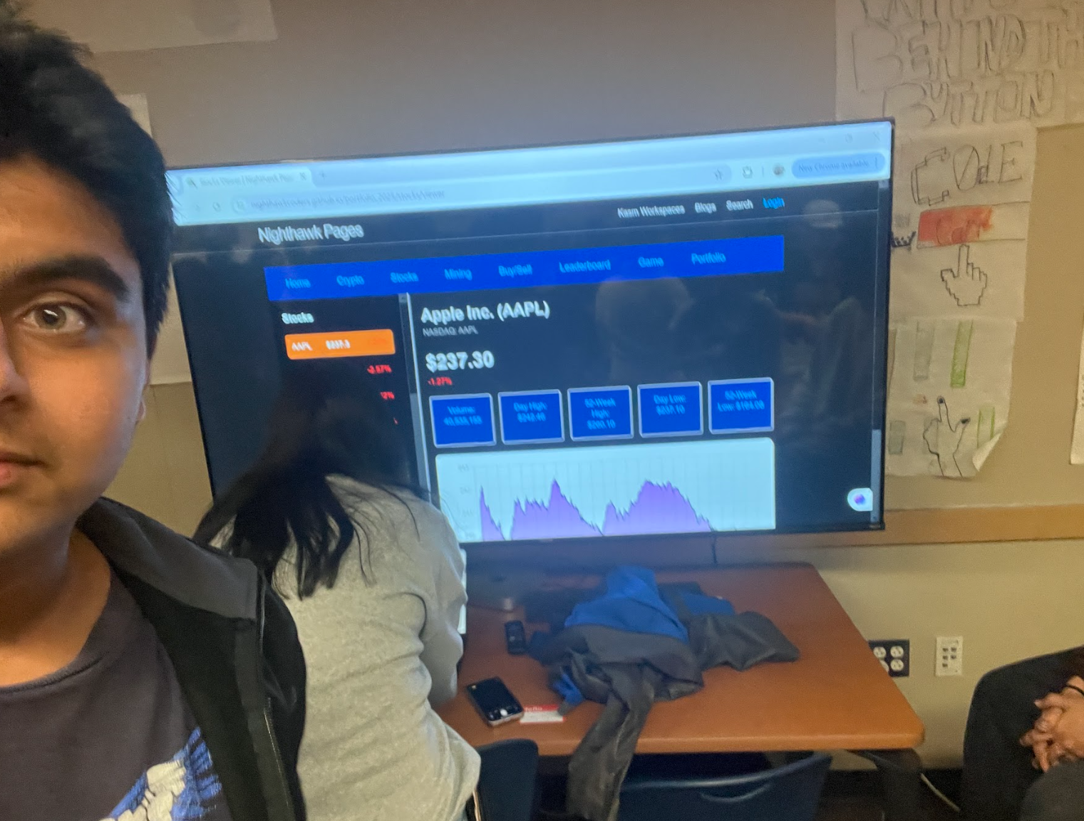
Because I am taking CSA next year, I wanted to get a sense of what CSA is like. So, I went to see one of CSA’s projects, which was a stock review.
To be honest, I was SHOCKED. It looked completely like a real stock exchange website. When I asked them if everything was real time data, they said yes, which was even more shocking to me. Looking at this project, I am excited about what is to come for next year.
Personal N@TM Feedback
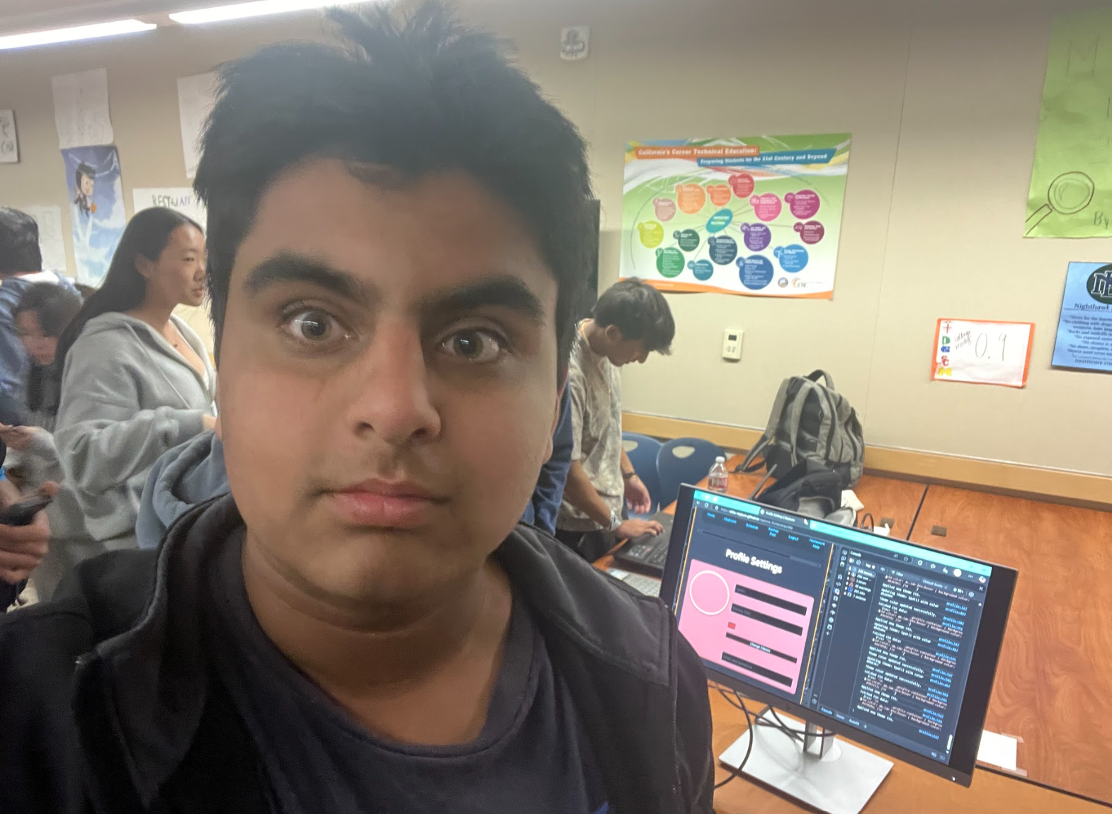
Like me who were giving feedback to others, I also got feedback on my site.
A lot of the comments were positive. They were something along the lines of
- Nice innovative features!
- CRUD Functionality works well
- I like how you have implemented user interest directly into your page
- I like the styling of the site, and the admin features
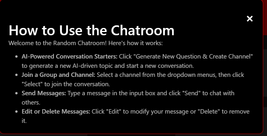
One of the most common bits of feedback was that users needed a guide to lead them through the page in case they got stuck. Knowing the importance of accessibility and usability, I acted on this immediately.
To assist in countering this, I implemented a popup modal that provides users with a brief, simple-to-follow guide on using the page. The modal is displayed to a user upon their first visit and can be reopened if needed. The guide includes step-by-step instructions, tooltips over key features, and a mini FAQ section to ensure even first-time users have a simple time navigating the interface.
Overall, I was extremely excited to show my work to a society of students, parents, engineers, and professionals. I am extremely proud of me and my groups work and I can’t wait to see what the future has in store for us.
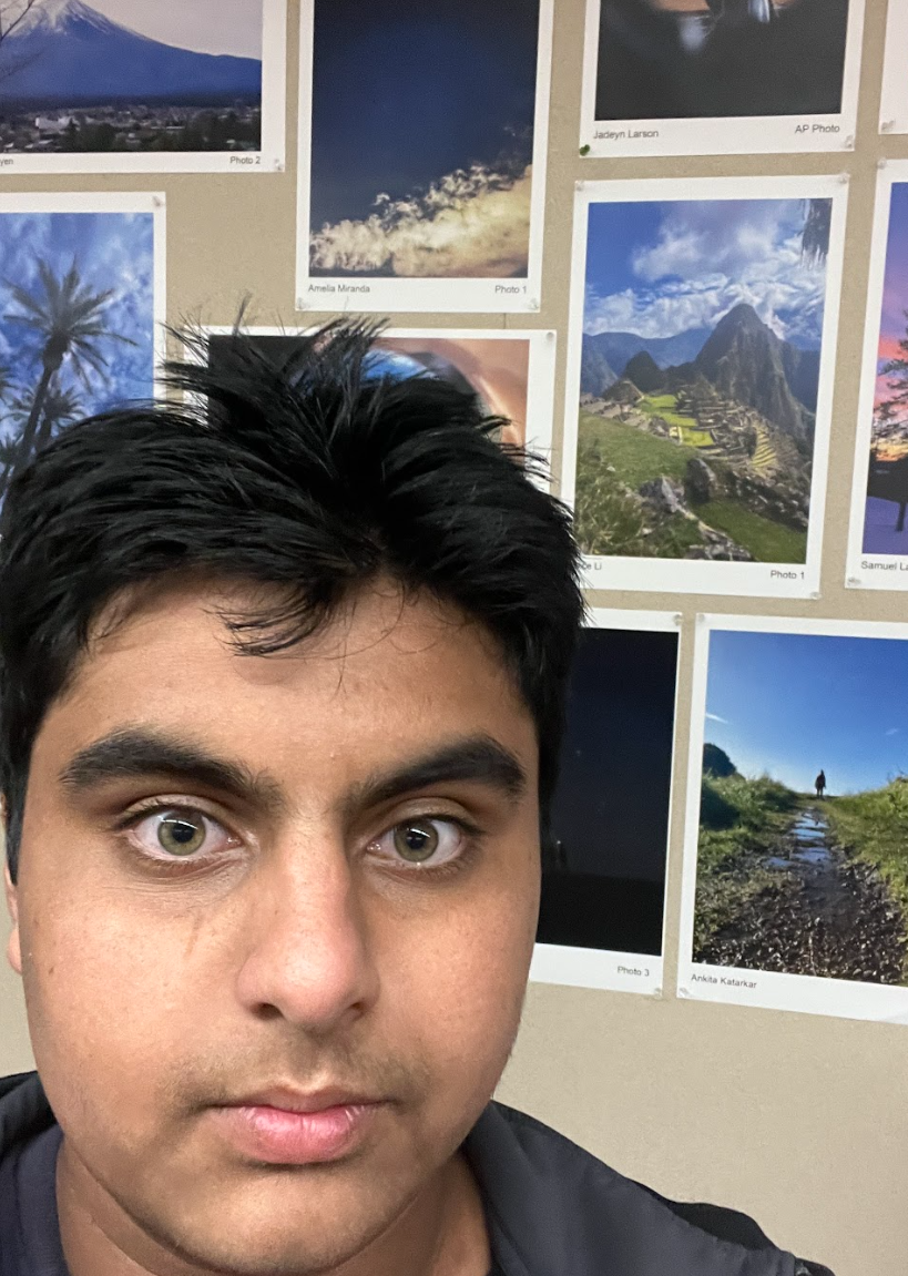
PS: To further get into the mood of N@TM, I also visited our Del Norte Photography Class, and I was shocked to see their photos. Like us in computer science, art also requires creativity, so it was something cool to see.